flowchart LR
subgraph Input["📥 Input"]
A["🖼️ Product Image<br/><i>515×515 px</i>"]
end
subgraph Processing["⚙️ Processing"]
B["🎨 Filter Background<br/><i>Remove white/transparent</i>"]
C["🧮 K-means Clustering<br/><i>Group similar pixels</i>"]
D["🎯 Extract Centroids<br/><i>5 dominant colors</i>"]
end
subgraph Output["📤 Output"]
E["✨ Color Palette<br/><i>Hex codes + %</i>"]
end
A --> B --> C --> D --> E
style A fill:#ec4899,color:white,stroke:#db2777,stroke-width:2px
style B fill:#8b5cf6,color:white,stroke:#7c3aed
style C fill:#3b82f6,color:white,stroke:#1e40af
style D fill:#f59e0b,color:white,stroke:#d97706
style E fill:#10b981,color:white,stroke:#059669,stroke-width:2px
9 Design Intelligence & Color Analysis
NoteBusiness Context
Packaging design drives purchase decisions at Vinmonopolet. When consumers browse the shelves, color and visual appeal matter enormously - especially in categories like rosé where the wine itself is part of the aesthetic.
This chapter shows how to use MCP’s image analysis tools to:
- Extract dominant colors from competitor packaging
- Identify visual trends in top-selling products
- Inform design briefs for new product launches
- Benchmark your brand against category leaders
9.1 The Design Challenge
A common scenario from brand managers:
“Our producer wants to redesign the Bag-in-Box packaging. What colors and styles are working in the rosé 3L category right now? I need data to support our design brief.”
Instead of guessing or relying on subjective opinions, let’s analyze the actual top sellers.
9.2 Real Data: Top 10 Rosé 3L Products (2025)
📊 Copy this prompt to Claude:

"Query the top 10 best-selling rosé wines in 3L format for 2025.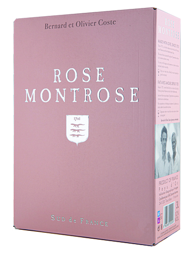
Include product name, liters sold, and product image URL."Key Insight: Montrose rosé dominates with 539,649 liters - more than double the #2 product. Let’s analyze what makes their packaging stand out.
9.3 Color Extraction: Category Leader Analysis
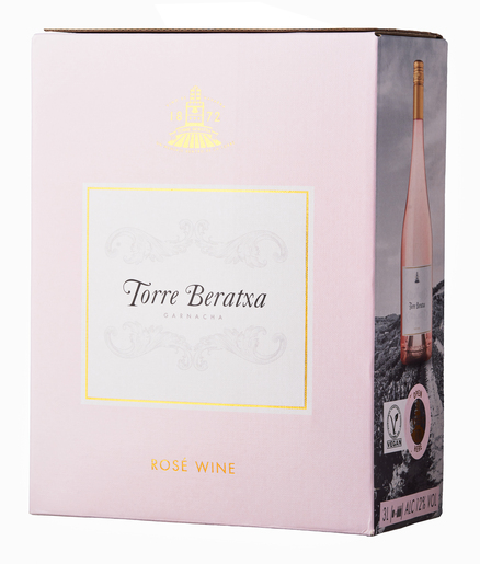
9.3.1 Analyzing Montrose Rosé (Market Leader)
📊 Copy this prompt to Claude:

"Extract the dominant colors from the Montrose rosé packaging:
https://bilder.vinmonopolet.no/cache/515x515-0/9772506-1.jpg
Give me hex codes, color names, and percentages."
ImportantMontrose Rosé - Color Analysis
| Color | Hex Code | Name | Coverage |
|---|---|---|---|
#CEA9A4 |
Tan/Blush | 49.9% | |
#C09C97 |
Rosy Brown | 34.5% | |
#EEDFDF |
Misty Rose | 8.5% | |
#D9C7C6 |
Thistle | 6.2% | |
#745D5C |
Dim Gray | 0.9% |
Design Insight: The market leader uses a palette of warm blush/tan tones (84% coverage) - colors that directly evoke the rosé wine itself. The minimal use of dark accents (< 1%) keeps the design light and summery.
9.3.2 Comparing Multiple Products
📊 Copy this prompt to Claude:

"Analyze the packaging colors for all top 5 rosé 3L products.
Create a comparison showing the dominant color palette for each.
Which products use similar colors? Which stand out?"9.4 Practical Applications
9.4.1 Use Case 1: Design Brief for New Product
When briefing a designer for a new rosé BIB, provide data-driven direction:
📊 Copy this prompt to Claude:

"Based on the top 5 rosé 3L sellers, create a design brief summary:
1. What color palette should we use to fit the category?
2. What colors would help us stand out from competitors?
3. What's the dominant design style (minimal, busy, premium)?"
TipData-Driven Design Brief
To fit the category (safe approach): - Use warm pink/blush tones as primary (similar to Montrose) - Suggested palette: #CEA9A4, #C09C97, #EEDFDF - Keep design clean with minimal dark accents
To stand out (differentiation approach): - Consider underutilized colors in the category: - Deep magenta/fuchsia (bold statement) - Mint green + pink (unexpected combination) - Matte black with pink accent (premium positioning)
Style recommendation: The category leans heavily toward “lifestyle casual” - an opportunity for premium or minimalist positioning exists.
9.4.2 Use Case 2: Seasonal Trend Analysis
Compare colors across seasons or years:
📊 Copy this prompt to Claude:

"Query the top 10 rosé 3L products for summer 2024 vs summer 2025.
Extract colors from both sets.
Are there any color trends emerging in the category?"
9.4.3 Use Case 3: Competitor Monitoring
Track when competitors change packaging:
📊 Copy this prompt to Claude:

"Extract colors from our competitor's new packaging:
[Product URL]
Compare to their previous design.
What changed and what does it signal about their strategy?"
9.5 Technical Details: How Color Extraction Works
The image analysis uses K-means clustering to identify dominant colors:
Parameters you can adjust:
| Parameter | Default | Description |
|---|---|---|
numColors |
5 | Number of color clusters to extract |
imageUrl |
- | Direct URL to product image |
9.6 Integration with Other Analyses
Combine color analysis with sales data for deeper insights:
📊 Copy this prompt to Claude:

"For the rosé 3L category:
1. Group products by dominant color family (pink, salmon, terracotta)
2. Calculate total sales for each color group
3. Which color palette correlates with higher sales?"
ImportantExample Finding
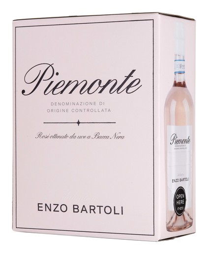
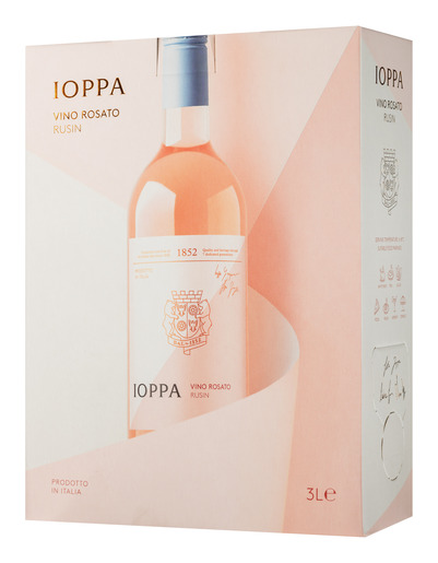
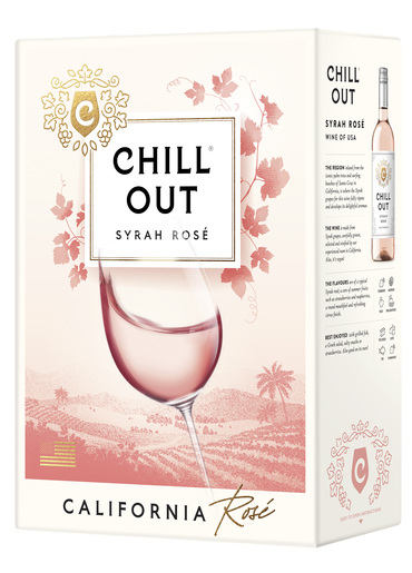
Pink/Blush dominant (Montrose, Ioppa): 710,526 liters (58% of top 10)
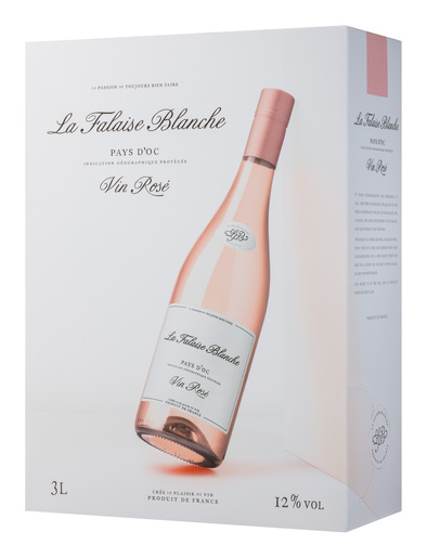
Salmon/Coral dominant (Chill Out, La Falaise): 207,993 liters (17%)
Terracotta/Warm dominant (Enzo Bartoli): 211,578 liters (17%)
Other: 99,375 liters (8%)
Conclusion: Pink/blush packaging correlates with 3.4x higher sales than other color families in this category.
9.7 Summary
TipKey Takeaways
- Product images are data - Extract colors programmatically instead of guessing
- Category benchmarking - Know what colors dominate before designing
- Differentiation opportunities - Find underutilized colors to stand out
- Correlation analysis - Link color choices to actual sales performance
- Trend monitoring - Track how competitor packaging evolves over time
9.7.1 Quick Reference: Color Analysis Prompts
| Task | Prompt Template |
|---|---|
| Single product | “Extract dominant colors from [URL]” |
| Category overview | “Analyze colors for top 10 products in [category]” |
| Competitor compare | “Compare colors between [Product A] and [Product B]” |
| Trend analysis | “Color trends in [category] comparing [period 1] to [period 2]” |
| Design brief | “Create color recommendations based on [category] analysis” |